If you create products, you must understand design.
Here are 10 principles you need to know:
1) Viability of system status
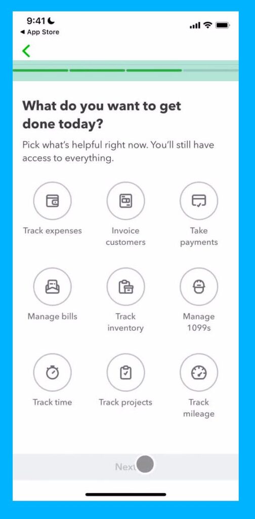
The user should always be informed about what is going on.
Give feedback to the user as soon as possible.
Be clear about where they are and what they need to do.
2) Match between the system and the real world
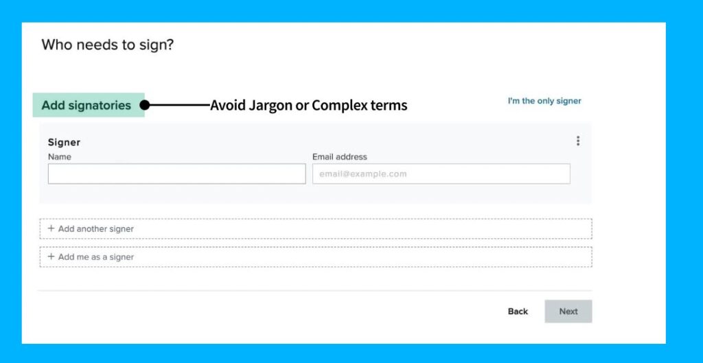
The design should speak the user’s language.
Use words and terms that they actually use.
Avoid jargon or insider talk.
Tip: use Hemingway app to keep your writing simple
3) User control and freedom
Sometimes users make mistakes.
Always give users an out or an exit.
Use undo, back, or skip buttons
4) Consistency and standards
Jakob’s law says that users spend most of their time not using your app.
They are used to how other products work.
So don’t reinvent the wheel for no reason.
Don’t make the user think.
Use conventions.
Break the rules where necessary.
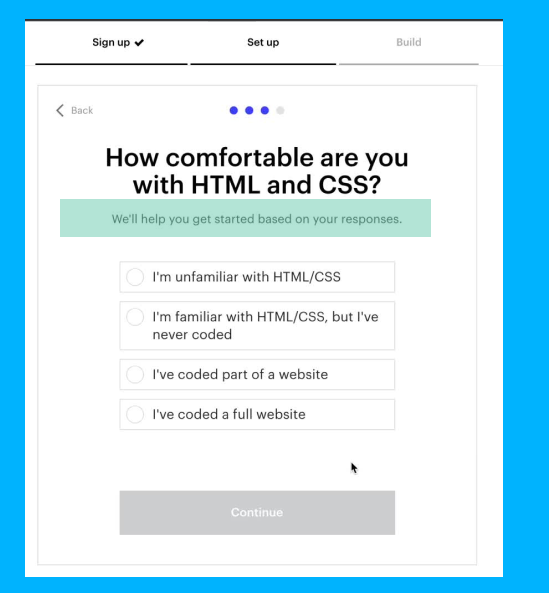
5) Error prevention
It’s nice to have good error messages.
But it’s better if errors didn’t happen at all.
Help users to not make slips or mistakes.
And ask for confirmation if they are making a big decision that may be a mistake.
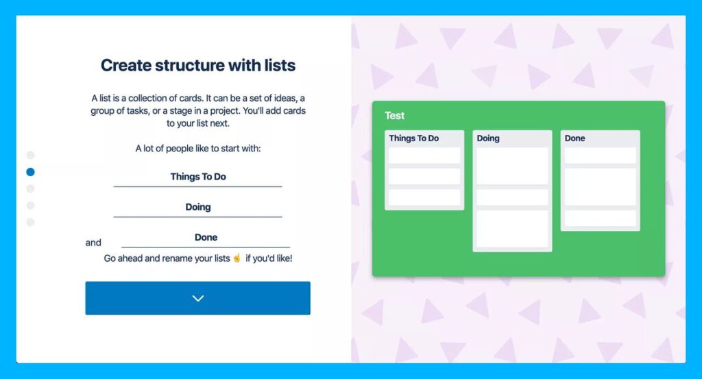
6) Recognition rather than recall
Reduce the cognitive load on users by making elements and actions visible.
The user shouldn’t have to remember information in their journey.
So don’t use out-of-context product tours.
Use walkthroughs & provide helpful information in context.
7) Flexibility and efficiency of use
Shortcuts and personalization can make the experience better for an expert user.
All without harming the experience for a novice user.
Use personalization to create better experiences for all users.
And allow customization.
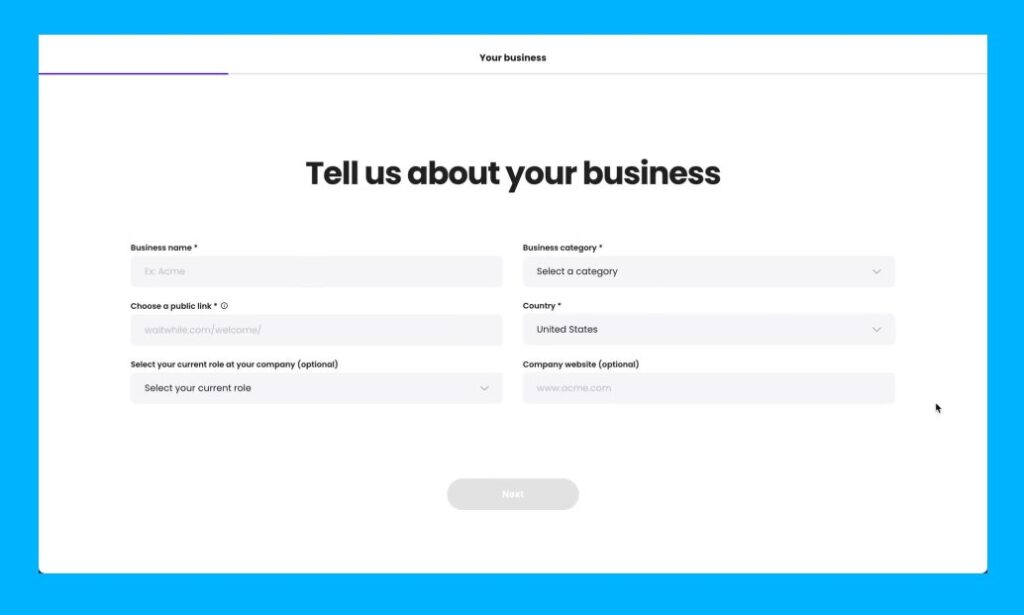
8) Aesthetic and minimalist design
Interfaces should not contain information that is rarely used or irrelevant.
It distracts the user and takes them away from their main goals.
This is especially important during signup and onboarding flows.
Use design to focus attention.
9) Help users recognize, diagnose and recover from errors
Use common error message visuals and colors like red text/ backgrounds.
Don’t use technical jargon.
And always provide the user with a solution.
Don’t just tell the user what they did wrong.
Help them resolve it.
10) Help and documentation
Your design alone may not be enough.
Sometimes users need more help.
Provide docs and useful prompts to help users understand how to complete their tasks.
Help centers and FAQs let users get the answers they need.
These are the 10 Usability Heuristics created by Jakob Nielsen.
They are broad rules of thumb.
No specific usability guidelines.
Feel free to break the ‘rules’.
Design in whatever way is best for the user.